Optimizing the usability of your online shop
Website usability is one of web design’s most essential and overlooked aspects. It defines the state of affairs within a website whenever someone interacts with it. For example, if you are searching for a product by clicking continuously on a website that gives access to it, you may quickly shut down the page you are trying to access. This occurs due to poor website usability, where you cannot navigate smoothly to find your desired product.
For an eCommerce website, it is all the more important to have a smooth functioning website where visitors and customers are willing to spend their time. In simple terms, the best usability on an eCommerce website is when it supports all types of shoppers and usage methods. When the website falls short on this, customers won’t find what they’re looking for, resulting in lesser purchases.
UX and UI for better usability
User Experience(UX) and User Interface(UI) are two distinct facets of website design that contribute equally to improving a website’s usability. UX focuses on a person’s experience using a product or a service. UI focuses on the design interface and can be corrected using specific tools.
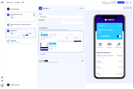
If you are wondering what are UI design tools, then think of them as resources for website designers and developers. They help create accurate wireframes, perfect prototypes, and viable products, all needed to enhance your eCommerce website’s usability.
Why is usability important for an eCommerce website?
The demand for online shopping has snowballed, especially during the pandemic. So, it is understandable when customers have high expectations from the websites they usually shop from. However, one can also notice that most customers abandon their order instantly if a simple checkout process is complicated. Therefore, web design and usability and two critical pieces of the puzzle.
In a world of giving and take, businesses should clearly understand what visitors expect from their eCommerce website and make changes when needed. Without which, errors in the website’s usability and functionality are bound to happen. The following are a few reasons why website usability is a must:
Reduces browsing time
Optimum website usability lessens the loading time and the browsing and helps visitors quickly find what they require. The website’s revenue is also impacted depending on the time visitors spend on a website. Site browsing should be pleasurable for all visitors, and improving usability is one method to achieve that.
Enhances credibility and engagement
Sites that face issues in user experience and user interface will see a drop in the number of visitors to their site. This is because people can find better alternatives easily, especially when the internet is home to countless eCommerce websites. But if an eCommerce website is consistent in its UX and UI, more people will find it trustworthy and contribute to higher engagement.
Improves omnichannel customer experience
Customer expectations and technological advancements have made it easier for brands to integrate their digital and physical existence. Advanced website usability can help meet those expectations and make the entire shopping experience, from store to website(and vice versa), manageable.
How can you improve the usability of your eCommerce website?
Increasing website usability for an eCommerce website is not rocket science. However, simple, actionable tips such as the following can produce remarkable results:
Optimize eCommerce website for mobile devices
The most used device in today’s time is the mobile. It is because of the habit of people getting things done on the go. Google’s algorithm has also considered mobile optimization an essential factor for crawling, indexing, and ranking websites. If you work on improving mobile usability for your eCommerce website, you will be reaching out to more audience demographic while building the engagement of the same.
Streamline the checkout process
A lengthy checkout process can lead to more cart abandonment rates. Your primary objective here is to make the purchase process simple and effective. Reducing the amount of information needed, such as name, address, and contact details could be one way of doing that. In addition, you could provide autofill options where the shipping and billing addresses are the same and save your customer’s valuable time.
Increase the loading speeds
People have multiple things to multitask for and want to get done with processes as soon as possible. They also don’t have long attention spans and wish to see rapid responses, especially from those eCommerce websites they regularly visit. If your site loads slowly, you will instantly lose half of your potential customers. Therefore, increase loading speeds if you want higher conversion rates and more customer satisfaction.
Filter and categorize your products and services
Most eCommerce websites cater to a large variety of products and services. As site navigation compliment the website usability, you should categorize your offerings based on price, size, product type, and more so that customers can narrow their search. The easier the search becomes, the higher the ease of using the website.
Personalize experiences
Customization and personalization are the way to go in the eCommerce world. You have the opportunity of connecting with your customers on a deeper level once you offer personalized experiences. For example, suggest products based on their search and order history and get them to discover more things closely related to what they like. As a result, not only will the customer favor for your website increase, but it will also influence them to place an order in the shortest time possible.
Choose the right colors and background
Color psychology is a tactic that is widely used for eCommerce. However, the colors you use should resonate with your brand and make your website look sorted. The background colors and texture should also be carefully considered because they all indirectly impact customer experience, which is simultaneously dependent on website usability.
Follow the F rule for images and text
Website visitors browse the site from left to right. Most retailers follow the F rules by positioning images on the left and inserting the text on the right. The image catches attention, and the text automatically explains what is happening. The F rule is a simple one you should follow to improve website navigation and usability.
Practice universal design
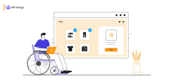
Inclusivity is a concept that has been implemented across all companies. Your eCommerce website should similarly be inclusive of all kinds of shoppers and their various needs. There could be differently—abled shoppers who love what your brand offers, and your duty is to simplify their shopping experience. Many of their challenges could be solved by adding features like voice search and ALT tags.
Experiment with interactive design
A basic eCommerce website could work adversely for you and make you lose customers. Since design and usability are two dynamic aspects, you could use interactive design to provide a seamless shopping experience to your customers. For example, filling out a form or leaving a comment are interactive actions you can take to improve website usability.
Concluding eCommerce website usability
If you notice, the best brands in the business have websites whose design is customer—focused. This is also needed to survive the intense competition between brands and online stores. Of course, one cannot limit creativity and usability within these nine tips, but when implemented correctly, they can bring more conversions to your eCommerce website than anticipated.


Leave A Comment
You must be logged in to post a comment.